Why are our projects predictably unpredictable?
The 2012 Wilson Research Group Functional Verification Study shows that around 67% of our projects are late, continuing a trend going back at least ten years.
As an industry we are pretty bad at estimating how much time it will take to complete a design unless we have previously done something very similar. Yet many projects involve substantial changes: implementing new protocols, incorporating new versions of IPs, increasing the number of CPU cores, implementing new power management schemes, etc.
We know there are going to be surprises, but being able to spot problems early enough to take corrective action is difficult: many projects use design teams located around the world with different tools, methodology, and even design goals. Getting timely, accurate information is a challenging problem in itself.
This analysis is reinforced by a recent design management survey showing the top requirement from project management was for global visibility.
Project metrics today
We want to build a picture of project trends from objective data, so existing metrics are a natural place to start. The problems with most metrics efforts today are:
- mostly focused on data coming from a specific tool
- comparable data from a different tool has to be interpreted differently due to vendor differences
- manual collection and presentation leads to stale data and inconsistent presentation
- data gathered for reporting may differ from data used by the teams
- questions raised during management reviews turn into action items taking days to resolve
- engineers feel disconnected from project goals and status reporting
What would good project visibility look like?
First, the data presented must be actionable, easily understood, up-to-date, based on the same data used day-to-day by the teams, and address specific key questions:
- is work progressing according to plan?
- what is the quality level of the design?
- what changes are happening in the design?
- are resources being used efficiently?
Note that there are generally not simple answers to these questions. Instead we must create compound metrics by combining data extracted and normalized from different sources. More on that later.
The trends presented to answer the above questions must be able to be explored interactively to better understand and take action where necessary.
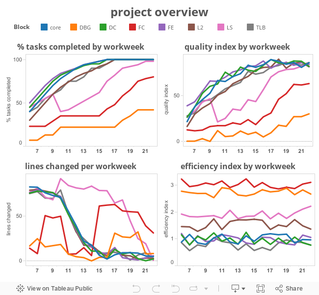
Below is an interactive mockup of a project-level dashboard for a fictitious project. The mockup is based off static data and allows a limited amount of exploration. A real system would be pulling data from a metrics database and allow more exploration and analysis.
A quick perusal of the charts shows most blocks are progressing reasonably, with a few exceptions. Clicking on a block’s name in the legend highlights its trend in each of the charts, adding context:
-
The FC (“FullChip”) block is an integration that doesn’t make much progress until the IP blocks are completed and their teams join the FC effort. The team is still working to reach quality goals in workweek 22.
The LS block has a disruption around workweek 10 that the team has to scramble to recover from. We will explore that in more detail below.
The DBG (“debug”) block has a flurry of activity early and later but was a lower priority and is not yet up to adequate quality levels.
Interesting trends are explored by examining the elements used to create the compound metric. For example, to understand what happened to the LS block development, we drill down into the elements of the change compound metric:
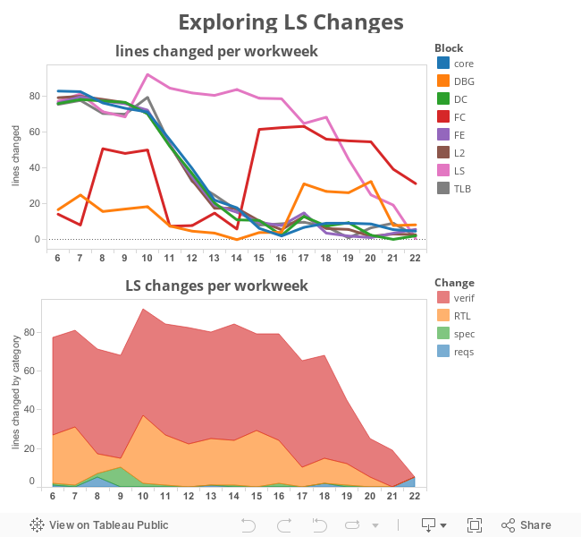
The elements available to create each of these compound metrics will vary by project. In this example, changes in requirements, specification, RTL, and verification are tracked, possibly from different issue and bug tracking systems.
Notice in this case a requirements change in workweek 8 led to a specification change in workweek 9, and a pause in RTL development in workweeks 8 and 9 (probably evaluating possible implementations offline) followed by a spike in RTL activity in workweek 10.
With that history in mind, the requirements change in workweek 22 would merit closer examination. Perhaps it is just a documentation update, but if not, it might require immediate action such as shifting resources or a decision on whether this change can be accommodated for the upcoming milestone.
Hovering over the workweek 22 requirements change pops up a tooltip with a link to the underlying data. In a real system this could be a link to the changes in question within the project’s requirement tracking system.
compound metrics
In this example of the compound change metric, each type of change is treated equally but the contribution of different elements could be scaled. For example, requirements changes could be scaled by 10x and specification changes by 5x to better reflect impact on the project and make these changes more apparent in the compound change metric.
tasks
This metric is composed from available project data: task tracking databases, verification plans, coverage, open issues, and milestone data from the project configuration. Shown here as %completion, it could also be displayed as burndown charts, etc.
quality
There are no absolute measures of quality, so a project-defined set of criteria is tracked: verification plan completion, code coverage, functional coverage, assertion density, code reviews, test suite pass rates, etc.
efficiency
This metric tracks the engineering time and compute resources for a collection of activities in a cost model such as the amount of compute resources to find a bug, the engineering time to isolate and fix the bug, number of bugs found, resources required to do a release, number of releases, etc.
In this example, the FC (“FullChip”) and DBG (“Debug”) blocks are less efficient due to more complex testbenches and debug environments.
Different views
The dashboard above gives a project-level view of important trends on a workweek basis. At least two other types of dashboards based on the same underlying data are useful:
-
A Team Lead dashboard that has details within the team’s block (as shown for change above) and displays it on a version rather than workweek basis. This dashboard may also contain data on the team’s loading and available resources.
An Engineer dashboard that is focused more on operational aspects such as open issues, upcoming task items, etc. The impact of work performed can be seen immediately as progress toward team and project goals.
Implementation
The overall idea is to extract summary information from working databases already in use, normalize the data so that it can be combined with data from other sources, and store it in a metrics data warehouse database. Dashboards and analytics work off of the metrics database.

The amount of data needed to record trends is much smaller than the working databases and leverages the idea of hyperlinking to existing GUIs for the source data (e.g., a vendor’s coverage browser).
With the basic framework in place, project specific design hierarchy, methodologies, and tools can be accommodated.
Becoming less predictably unpredictable
When you realize that project-level decisions are often made on stale, inconsistent data, it is not surprising that corrective actions are not taken to keep a project on schedule.
At least part of the answer is to extract and normalize data from different flows and design sites and present project trends. With an automated process, data will be current and allow earlier recognition of trends that can be addressed in a timely manner.
© Ken Albin and System Semantics, 2014. All Rights Reserved.